Forum Upgrade Troubleshooting

As you may know, Chuck has recently put in a great deal of time to upgrade our forum which will provide us with more tools to combat the Spambots.

With any upgrade there will be small issues to fix. If you spot anything, please report it here so it can be addressed. Please be specific in where or how the issue occurs.

Thank you.

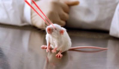
I’m having trouble with my laser mouse.

Oh - FORUM problems. Got it. :smiley:

I have noticed than when one opens up a profile page for a user there are several missing images which result in error images.

To repeat: Click on any username link to view. I have checked this in Chrome and IE 7.0.

I’ve got Firefox 3.x and I’m not getting any “broken links” type stuff when I look at your public profile…

Ditto for Safari.

Frakkintalos seems to have more Friends than me. That can’t be right.
Please troubleshoot that error :wink:

Strange, I confirm as well with my Firefox version. So it is an issue only with the two browsers I primarily use. Weird.

Me too!

He keeps losing his ruby quartz glasses and taunting my cat.

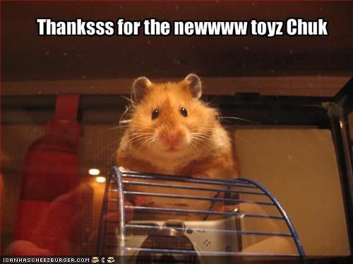
I was commenting to RMHPH that Chuck does all this hard work to make this upgrade for us and we’re like a bunch of gerbils. We get completely excited about crawling through the new tubes and playing with the new “toys” that we inadvertently got as a side benefit of the upgrade, completely forgetting that Chuck actually gave us a safer “house”. So, by the way, Chuck…thank you for the safer house (as well as the new toys and tubes to crawl through).


I have noted in IE and Chrome the tags that appear in the forum appear as broken images…this works fine with Firefox and Safari.

Strange.

Not my Safari (Tiger)

I get the question mark where I think the stars for rating should be. I use Safari. I am not very knowledgeable about this stuff but I hope I can be of help.

Thanks again Chuck.

same here–though it was working initially

I got a bug to report here. Well, not really a bug, it’s more of an oversight, I suppose. Basically, in the new user profile pages, you’ve got the wrong background-color in the css for the little div where the user avatars are:

(Above) Normally, this would be a non-issue for most people because people have their avatars occupying the whole div. I only noticed because my avatar has a transparent background, so a little bit of the background peeks through. Anyway, you can see clearly here in Visitor Messages Display, that the background is incorrectly #FFFFFF, instead of #555555.

(Above) You can see that the problem also exists in Show Friends Display, the big one for the left column, and also the Mini Show Friends Dispay, the little one for the right column. Both backgrounds are white, instead of the correct shade of grey. (And keep in mind, the edges of Topgun’s avatar is not transparent, but in fact, white.)

(Above) In Show Conversation Between… display, again the same problem, except instead of being incorrectly white, it’s incorrectly #777777.

So, I don’t wanna be an ass about these things, but I figured I’d bring it to your attention anyway, since it’s a trivial fix. If you meant for these colors to be there, and I’m mistaken, then I’m sorry about the fuss.

Have a nice weekend!

Good catch DBT! I was wondering about that. I thot something looked weird but couldn’t place it.

Yeah, it’s a little subtle thing that won’t affect most people, but I figured I’ll bring it to Chuck, Solai, Pike’s attention anyway. They can decide whether they want to bother fix it or not.